Does this question bother you – “What if my website is already viewed on a mobile, then why the hell am I still landed here?’ The answer to this quite simple, yes you have a website, but did you make your website mobile friendly? Is it usable by the target customers?
Just have a look around on any mall, in any terminal or even around the conference table at work and you are obligated to find many individuals adhered to their Smartphone.
As software developers improve their web networks, the hardware engineers have also geared up to produce custom-friendly applications in Smartphones and tablets to easily browse the Internet anywhere and anytime. Therefore, it is very important that your businesses have a mobile friendly website, thereby increasing the comfort level of your users.
As per survey made by industry foresights, there will be nearly 1.7 billion mobile web users by the end of this year. It’s time your website is mobile friendly and you would have at least few Smartphone users visiting your website and viewing on screen that is just a few inches.
We, at ITLANDMARK, offer you avant garde ColdFusion web development application to upgrade your website making it user-friendly on a broader sense.
Why is a Mobile Friendly Website so Important?
Your business should target customers from all walks of life. For this, your website should be accessible through mobile devices. It is always good that you make a good mobile impression among the users.
A tactful mobile site would be great for your business. Amazon.com is regarded to be the top destination for mobile shoppers. It was ranked 85 points out of 100 in scoring the favorite mobile shopping site.
The infographic below very clearly shows the conflict for Smartphone sway between iPhone and Android devices, both of which contribute to the much traffic to ecommerce sites. Furthermore, it also shows the various shopping activities of the mobile users.
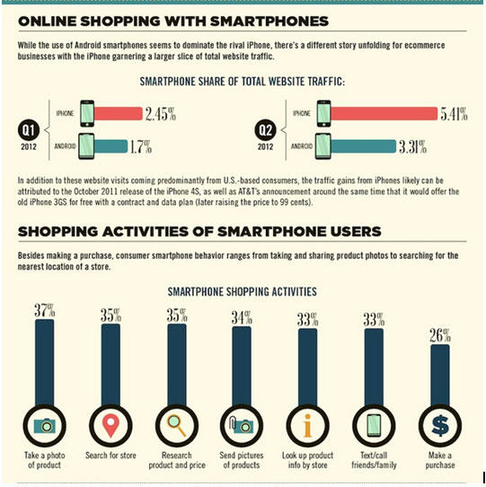
Courtesy: hubspot
Websites that are made for customizing in mobiles are not the shrunken down versions of the standard website. Instead, they are made purposefully for small screens. Our ColdFusion technology can help in rearranging the basic navigation and content in your website.
A good mobile friendly website should be simple to navigate, quick, have big buttons, easy to read and compile key information. Moreover, the websites optimized for mobiles take added advantage of the natural potentials of mobile devices. Features that are embedded for mobile friendly sites like maps, click to call and location information help customers connect to your business, by driving more traffic to your stores.
Small businesses are very keen in optimizing their sites, using mobile devices and social media sites to boost their e-commerce marketing.
According to a recent survey made on 3,000 small to medium business owners, by Infomobile, an Asian based survey company at Hongkong, it was studied that these are fast adopting the efficient use of social media sites like Facebook, Google+, Twitter and more besides mobile technology to offer their businesses quick online exposure.
How to Make your Website Mobile Friendly?
There are relatively easy ways for a mobile friendly website, many of which can cost very little.
ITLANDMARK ColdFusion technology and programming has strongly transformed many websites into mobile friendly that helped them reach heights in their businesses.
Some well researched mobile statistics show that nearly 33% of US consumers do their online shopping through mobile devices and 84% job seekers like to have mobile friendly websites for easy job search. We completely understand the drawbacks of mobile devices with your website and scale the functioning as needed.
The average order value for Smartphones is just 5% less than desktops or laptops. Moreover, the U.S consumers spend nearly 1 of their every 10 e-commerce dollars using mobiles. Keeping this in mind, the online business owners should consider the strategies that attract and engage users on Smartphones, ultimately converting them in to traffic.
We could make your website mobile friendly. Contact US for a quote..
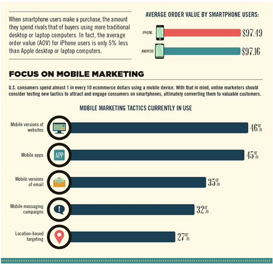
Courtesy: hubspot
Making mobile friendly website sometimes may require scaling down the functional design to an essential level. It can involve replacing images with text or removing JavaScript or many more. Our savvy team of designers and programmers strives hard for creating cutting edge e-commerce website for your targeted mobile users.
By making a small investment on your website to turn it mobile friendly, you can be better equipped to meet you customers’ needs, capture their thoughts and convert that into a sale.
Our ColdFusion 10, the rich version of ColdFusion, lets you adopt HTML5 markup language through its feature set even with zero knowledge of this marker language. This version focuses on ease of productivity, use and security.
You can Contact US for our quality based services. We assure you that you will be offered the best services in mobilizing your website and making your businesses reach heights.
